Napolii
Italian gin
Napolii is an Italian gin brand. Distilled from olives, rosemary and thyme, it perfectly matches the Italian cuisine, revealing the contrast between the most refined gastronomic standards and the simplicity of Naples.
The drafting of the brand platform ended with the creation of a name. The gin and the distillery would bear the same name to get a mono-product brand. We had just created Napolii.
The addition of an 'i' to the correct spelling of the city's name has a simple function: to catch the eye and favour memorisation. It conveys the inexhaustible enthusiasm of Neapolitans and symbolises the richness of Italy's taste.
With an immediately evocative name to facilitate identification, memorisation and favour local, national and international appeal, Napolii is the Italian gastronomic gin. But Napolii is more than a gin, it is an ode to the Neapolitan art of living; a duly celebration of a climate, a land and ultimately an attitude made of sharing, generosity, enthusiasm and devotion.
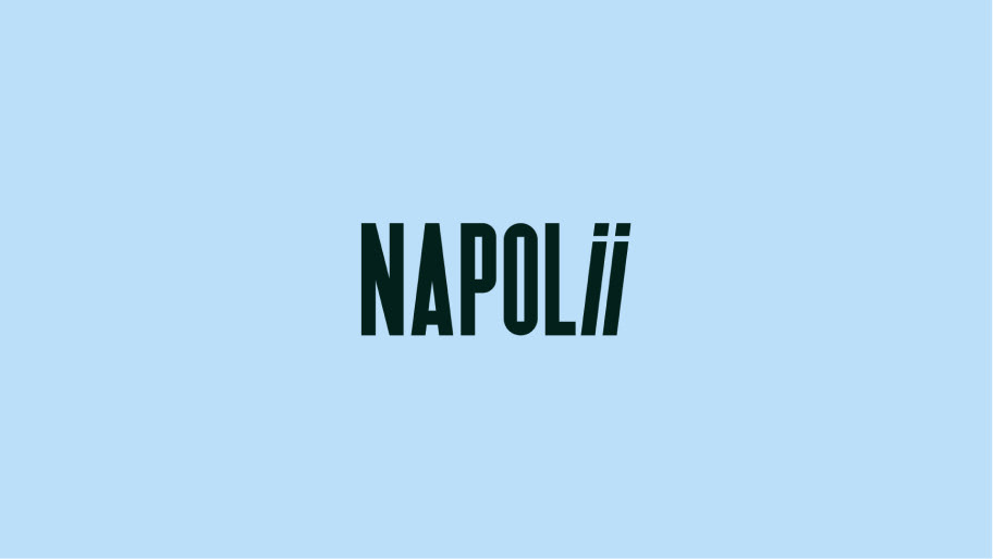
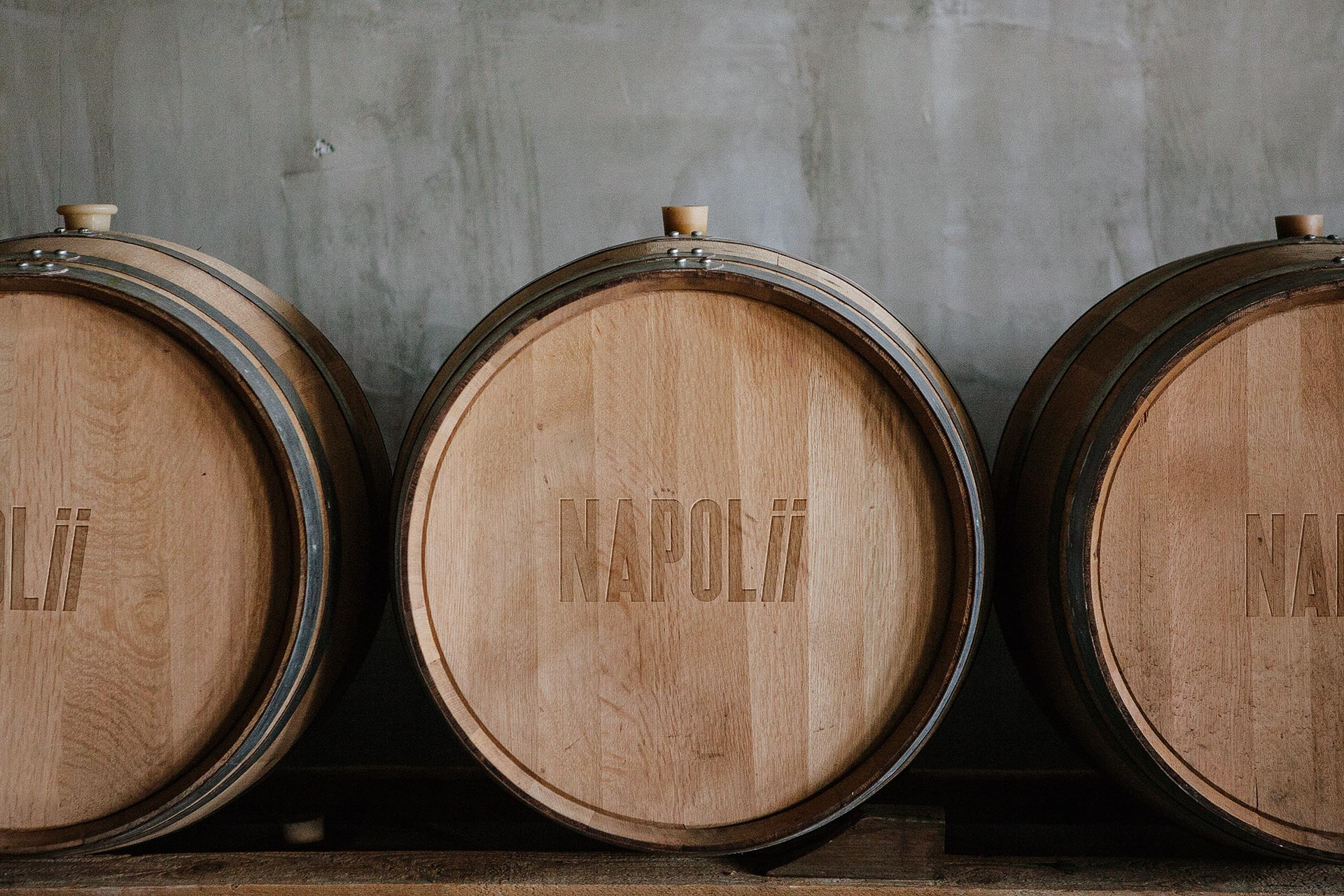
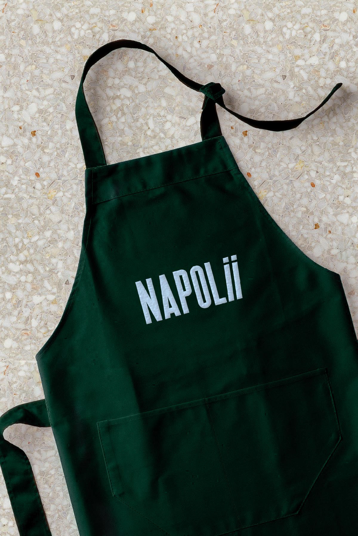
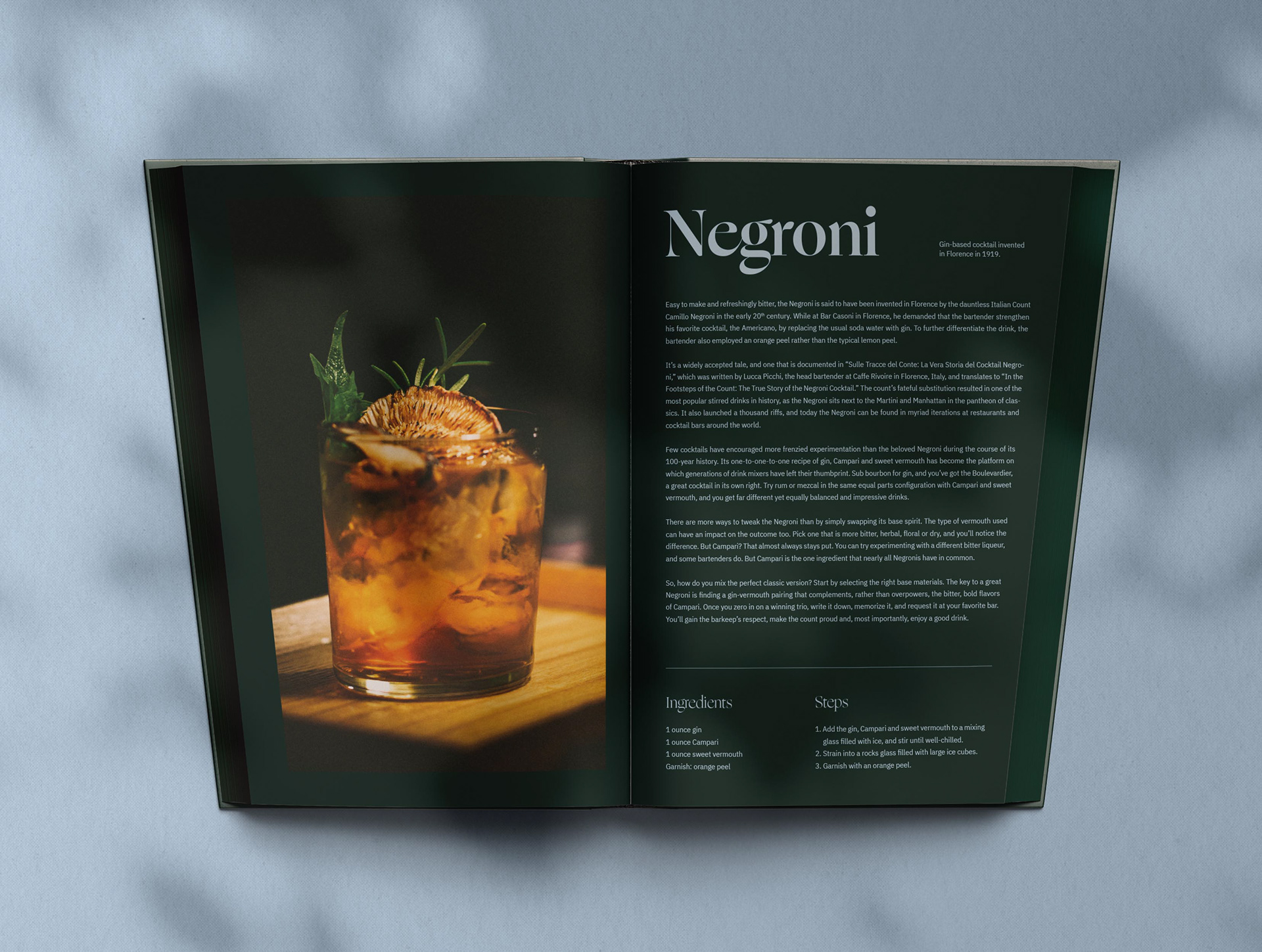
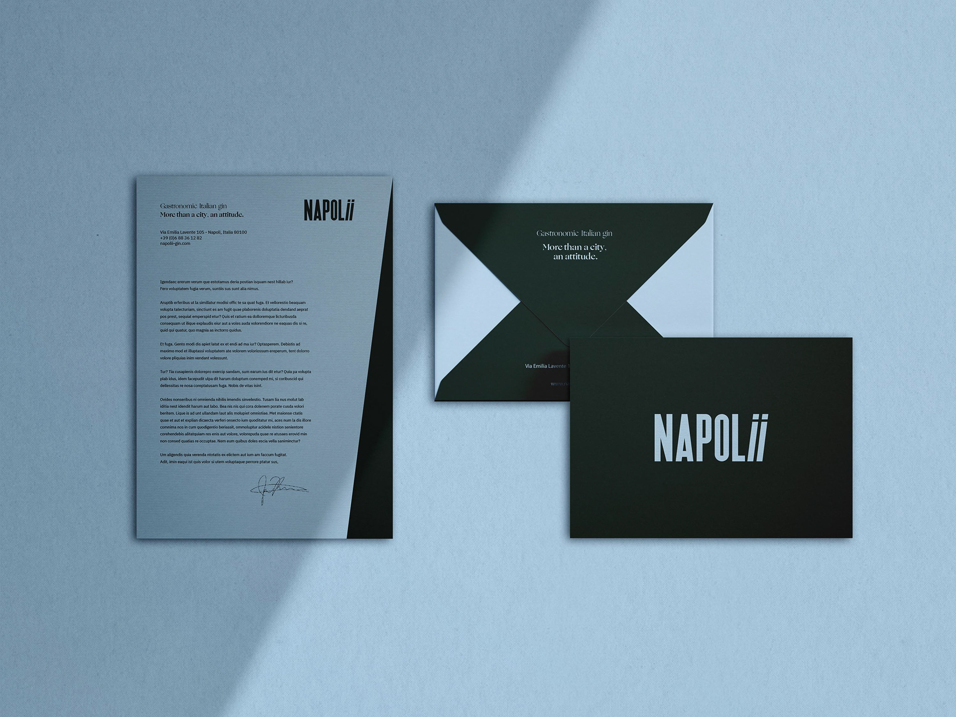
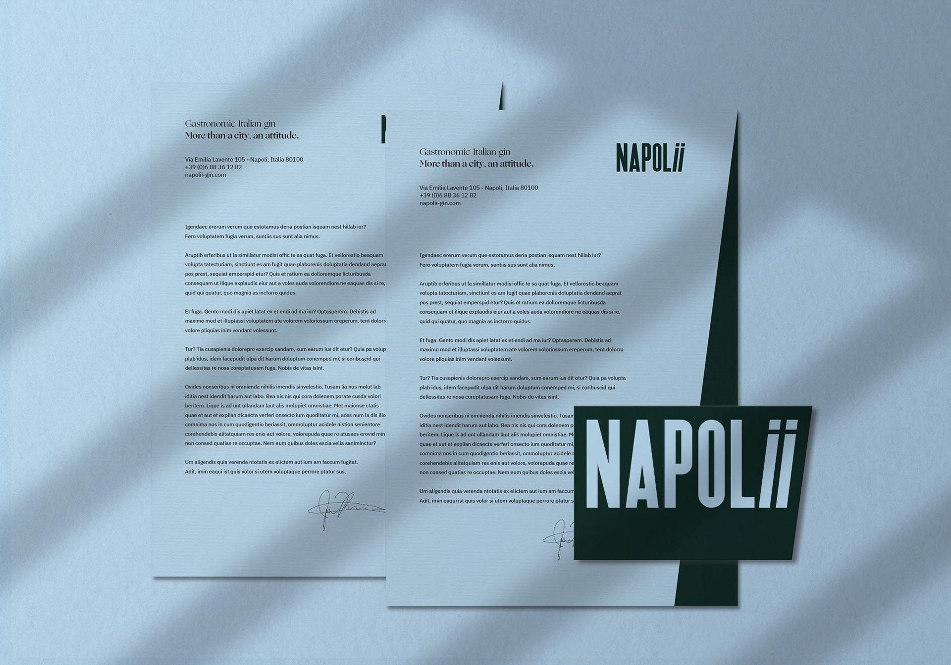
As for the design, we wanted it to be graphically effective. Like the product, we chose to associate Naples with Italy: a deep green which stands for Italy; a light blue to evoke the Neapolitan football team's shirts. The typeface of the logo has been especially designed for the brand; a sans serif font, impactful and slender. In addition to these elements, the slant of the two 'i' in the logo, symbolising enthusiasm, can be found in all communication media.
The result: a sober and elegant brand identity which sticks with this sophisticated distillery and gin.



See the project on topologies.studio

