Nacarat
Real estate developer
Nacarat, a well established French real estate developer, asked us for a rebranding counter-proposal. While its executive team approached its longstanding creative agency, its Chief Communications Officer had consulted us. We were willing to take the challenge.
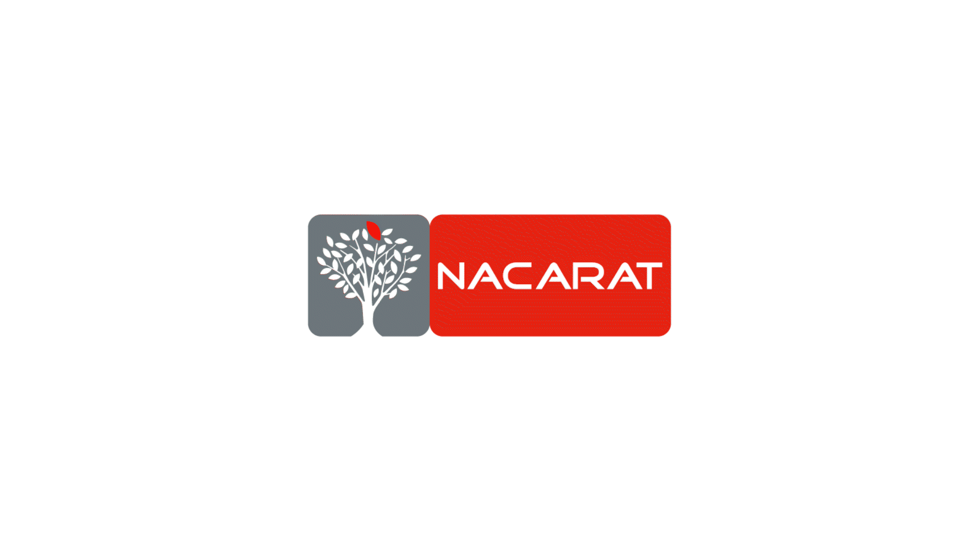
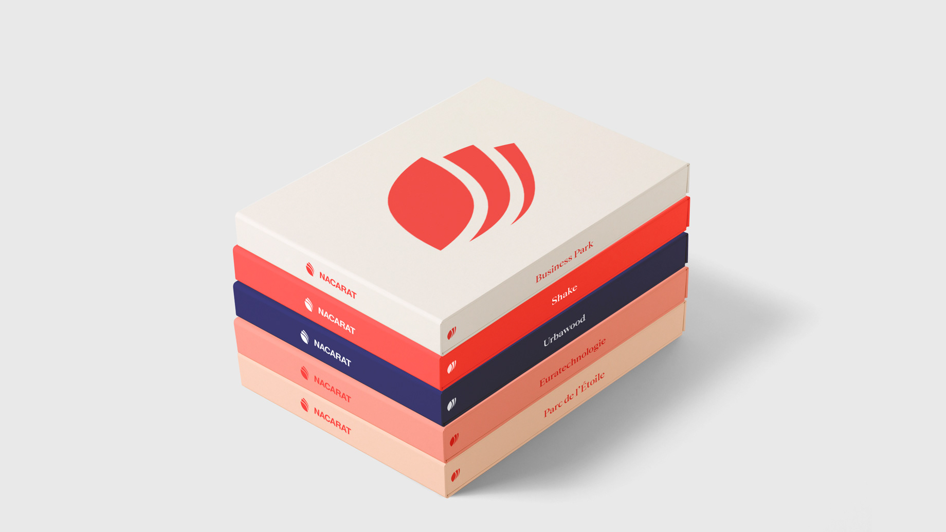
Nacarat's former logo had been displayed for 11 years. Even if it didn't catch the eyes of its external audience, it created emotional value for employees. Therefore, as soon as we took the brief, we had one conviction: the change of Nacarat's logo should be an evolution rather than a total rupture.
In fact, Nacarat's brand symbol was too complex. In most cases, a good logo is a simple one; greatest designers agree on the subject. So we knew we had to find the best way to simplify the brand symbol. A "lifting" duty, as we call it.
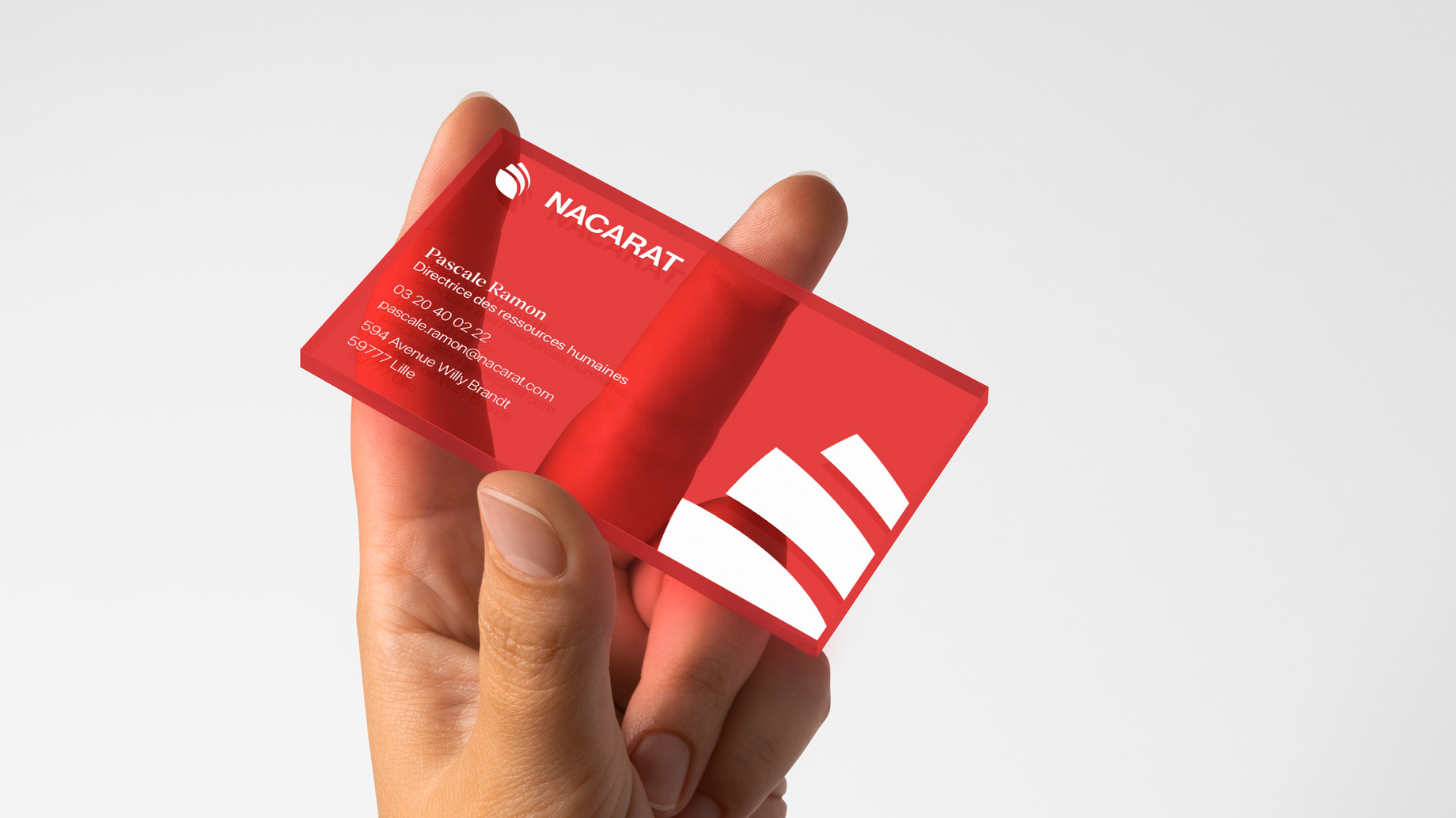
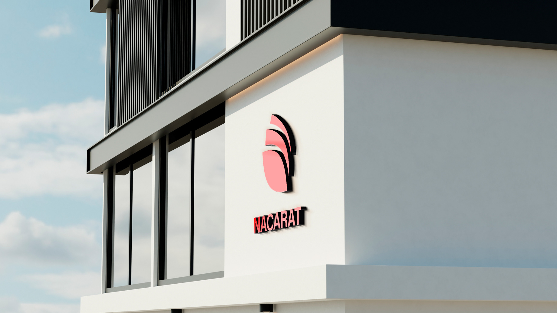
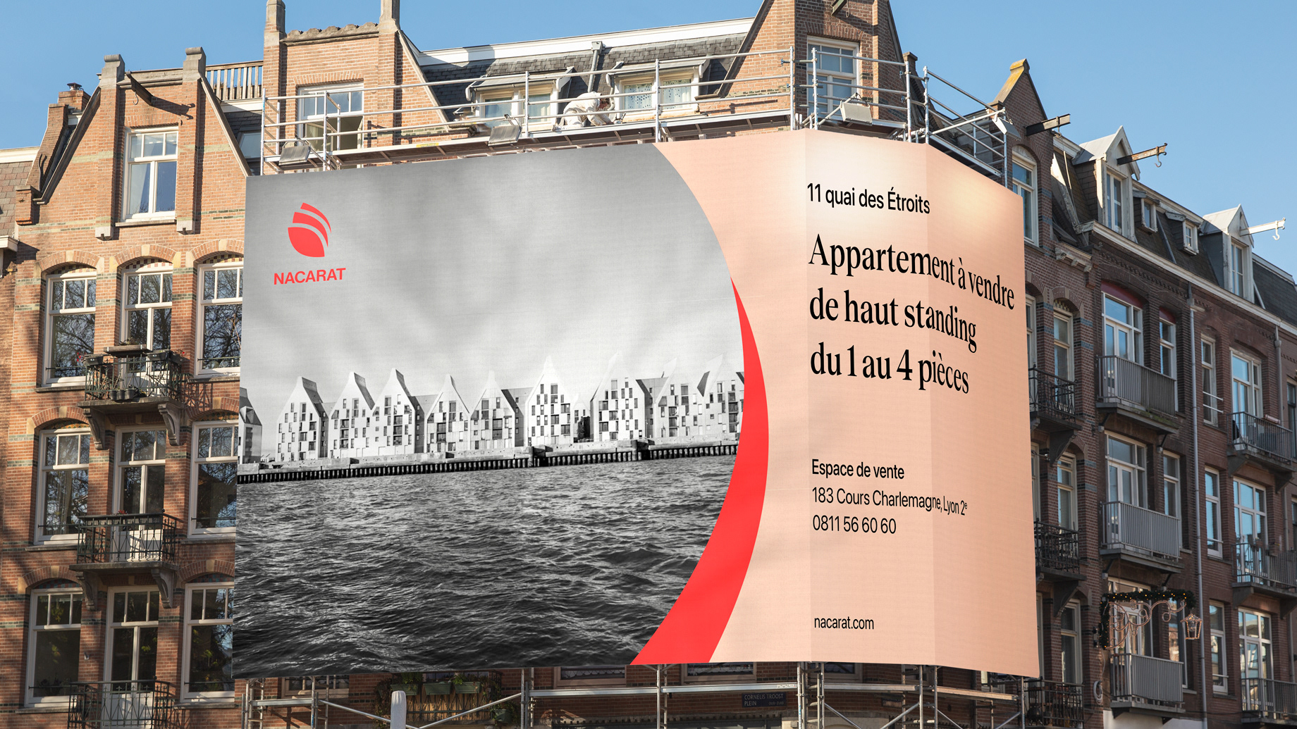
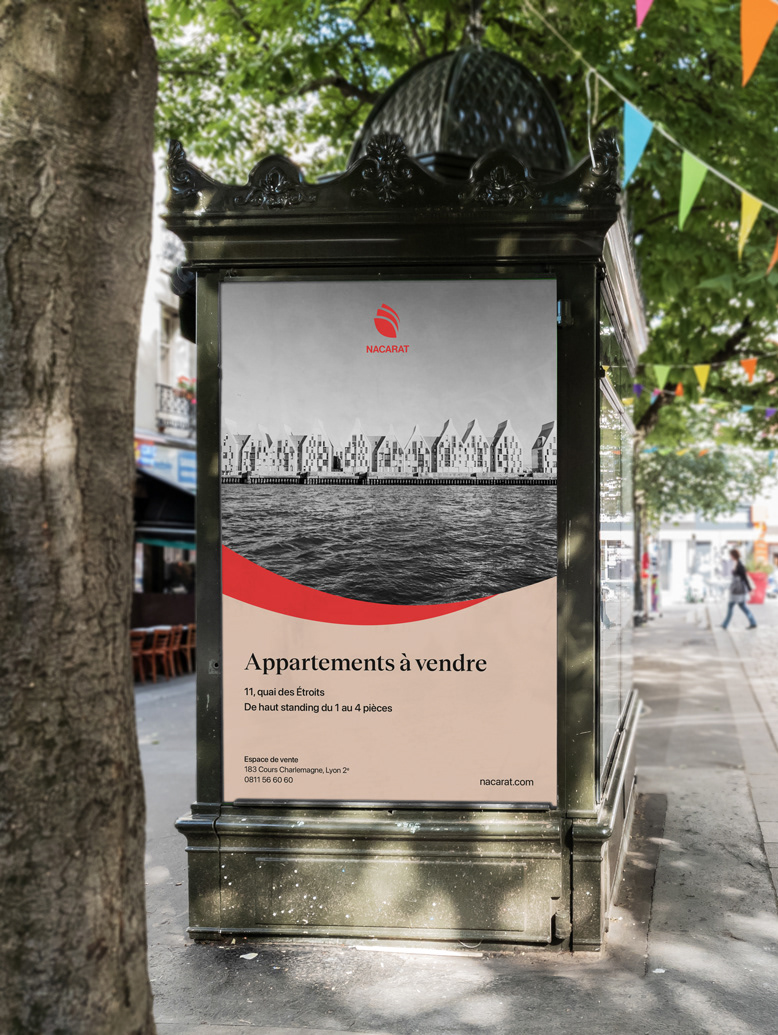
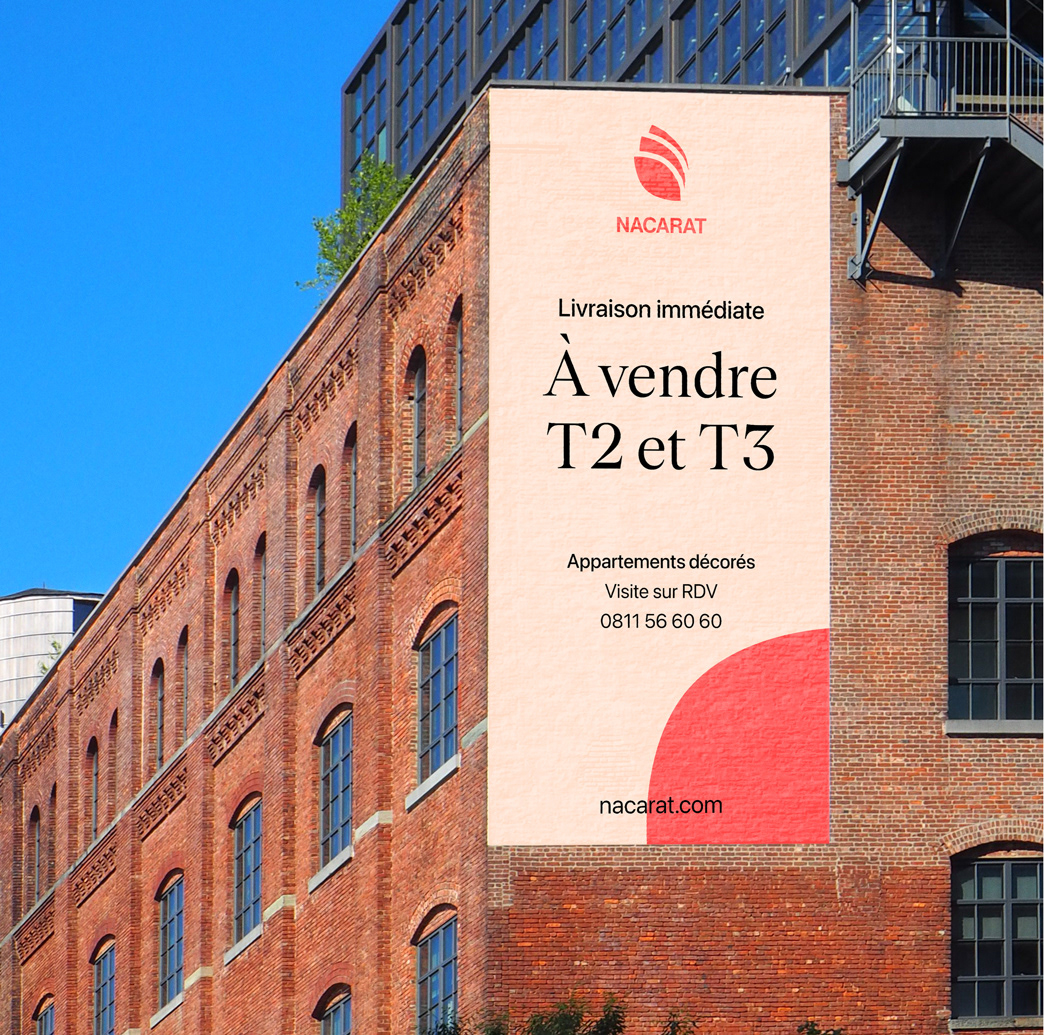
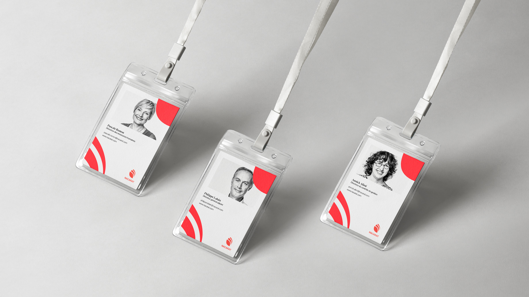
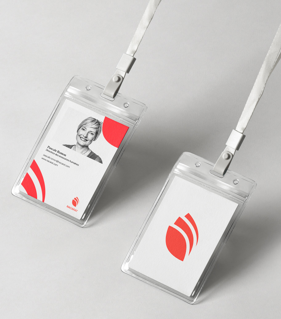
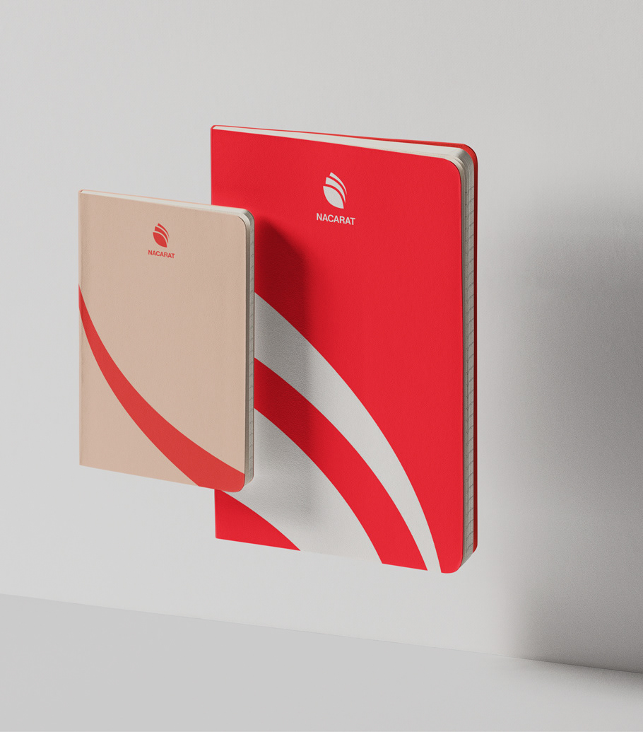
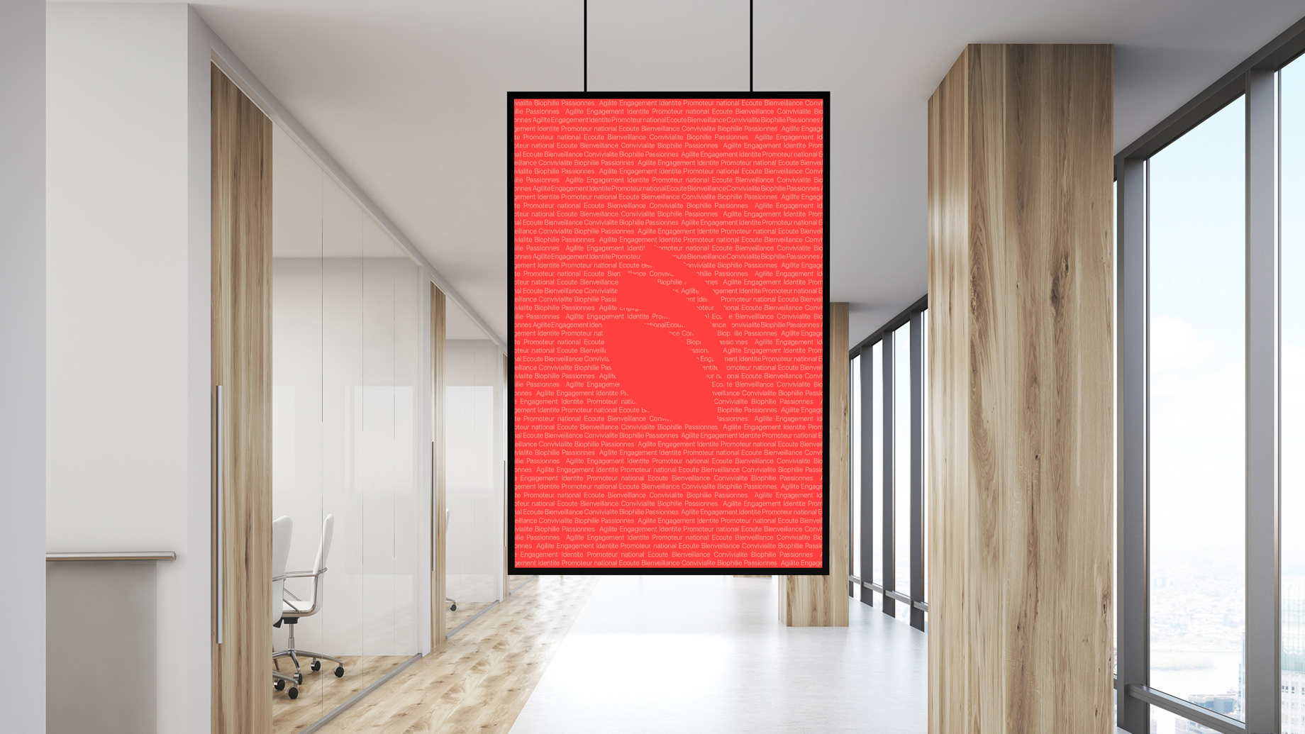
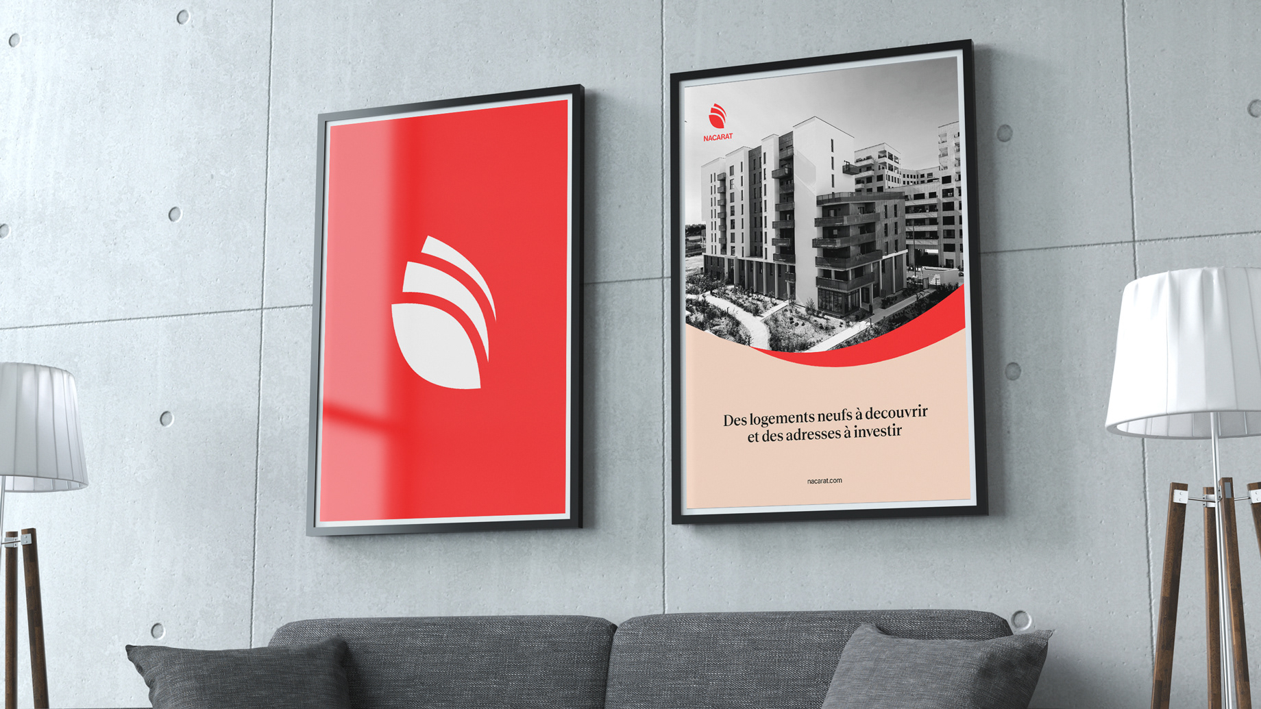
For us, lifting the red leaf was the most efficient thing to do.


See the project on topologies.studio